Spatial Analyses
This choropleth was creating through a multi-criteria evaluation which relied on weighted criteria. The criteria for the analysis involved distance from grocery store, median household income, households with people under 18, and neighborhoods without a free fridge or pantry. The goal of this analysis was to find a Portland neighborhood that struggles with food equity, so the non-profit group “Free Fridges” can install a fridge for the most needing neighborhood. The result of the analysis shows Sunderland is the neighborhood which needs a Free Fridge.
This choropleth displays the location of Portland homicides from 2020 and the percent of population below poverty level. In order to map the homicides, I created a spreadsheet on Excel to geocode the address. I included a graph that illustrates the count of homicides by neighborhood. The results of the analysis show that Hazelwood and Kenton have the highest counts of homicide. There is also a weak positive correlation between poverty level and homicides for the year 2020.
This map was generated using a Composite Index Analysis of Portland, Oregon. The goal of the analysis was to find the best neighborhood for the working-class population. The criteria involved in the analysis was mean sales price, number of homes sold, total acreage of public parks, and miles of bike lane. Neighborhoods that scored higher than a 3.5 were considered to be the best suited neighborhoods for the working-class.
This dot map displays the West Coast results for the 2020 Presidential election. Each dot represents 3,000 votes. The blue dots represent votes for Biden and the red dots represent votes for Trump.
This analysis highlights a hydro-reconditioned watershed in an urban environment. I used a DEM, DSM, and a collection line layer (sewers) to hydro-recondition the watershed from Mt. Tabor to the Columbia River in Portland, Oregon. Hydro-reconditioning a watershed creates a more realistic output since manmade features like collection lines impact the flow of water.
This map highlights a hydro-reconditioned watershed in Tryon Creek, Oregon. I created the original watershed using a DEM and layered the hydro-reconditioned over it which utilized a collection line layer.
Using a DEM of Portland, Oregon and two lookout points, I generated a Viewshed Analysis. The analysis shows the visible landscape that a person could see if they stood at either points and it displays the landscape that is visible from both points.
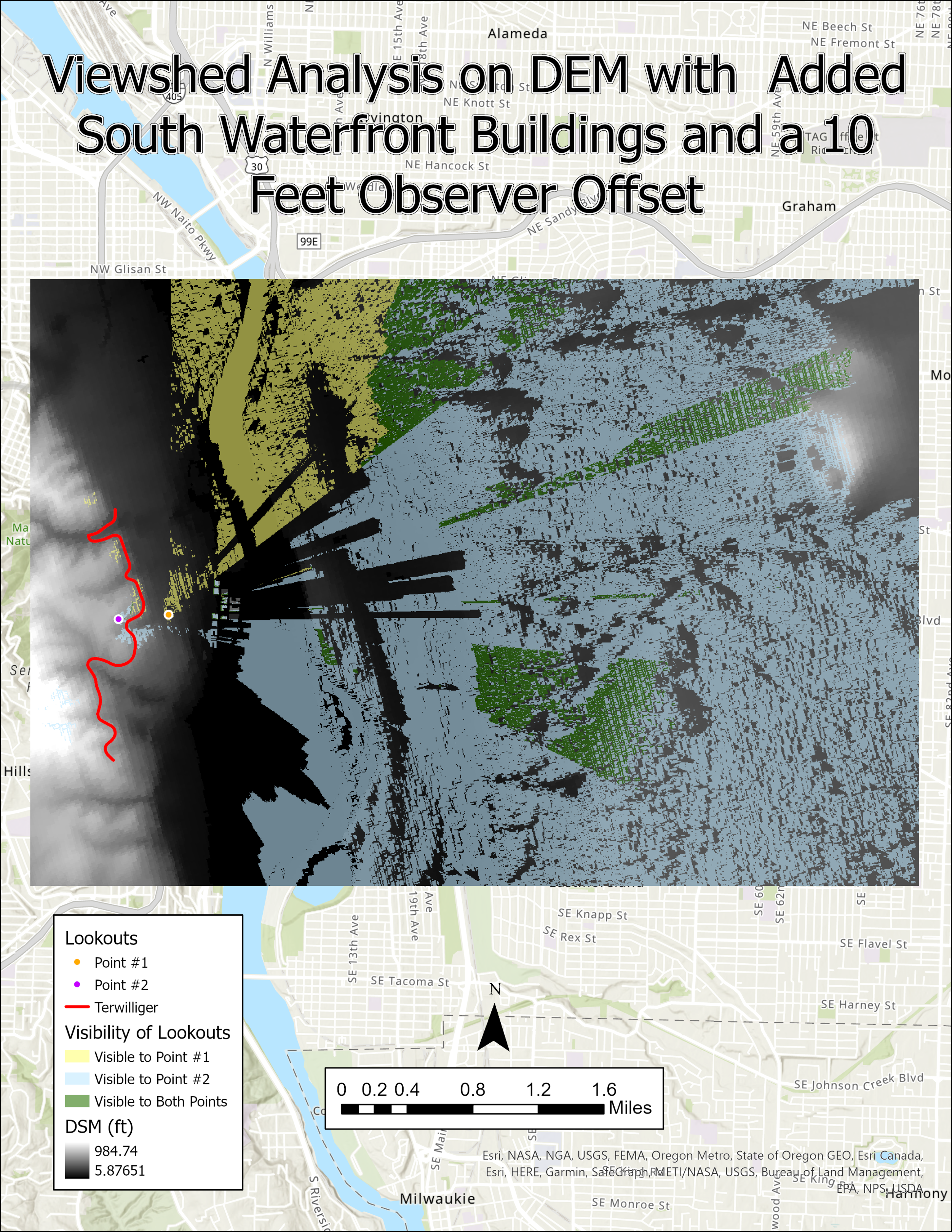
This Viewshed Analysis of Portland, Oregon is similar to the previous, however, buildings were incorporated into the analysis which increases the real-world accuracy. Instead of using a DEM, I generated a DSM for this analysis since buildings are visible. Large rectangles can be seen in the Visibility of Lookouts due buildings blocking the view.
This choropleth highlights confirmed Covid-19 cases for each county in the United States of America. The data was normalized to give more accurate results. I acquired the data for this map from John Hopkins University in November 2020.
This graduated symbol map highlights Covid-19 related deaths for states west of the Mississippi River. I acquired the data from John Hopkins University in November 2020.
The remote sensing image to the left highlights changes in surface elevation in Beaverton, Oregon from 2009 to 2017. The dark blue-purple colors represent surface that has increased in elevation, while the orange-red colors represent a decrease in elevation. The red circles in the northeast section of the image are trees that were cut down.
This remote-sensing image displays sites of clearcutting in Scoggins Valley, Oregon. The red shapes within the study area represent sites of clearcutting. I used remote sensing images from 2014 and 2019 to distinguish sites where trees have been cut. Using edit/create tools in ArcGIS Pro, I highlighted sites of clearcutting by hand.
The map on the far left is a choropleth that displays the population density (percent) for census tracts in Beaverton Creek, Oregon. The darker colors represent high population density while the lighter colors represent low population density. The map on the far right is a dasymetric map which displays the population density for each pixel; each pixel is assigned a different color. A landcover type layer was incorporated so that uninhabitable areas could be excluded from the analysis.
This analysis highlights the landcover type for the Portland Metro Area. The map incorporates a layer from the National Land Cover Dataset and a county layer. The Tabulate Area tool was utilized to generate a table which displays the percentage of area that is covered by the majority landcover type.
This analysis indicates highway accessibility for each county in Oregon. The Zonal Statistics tool was utilized to find the number of highway pixels per county; counties with more highway pixels are considered to be more accessible.
This series of choropleths displays the percent of the population under 18 years old by census tract in the Portland Metro Area. Each choropleth uses the same data but the conceptualization of spatial relationships differs. Anselin Local Moran’s I spatial autocorrelation statistics were utilized with three different parameters (Inverse Distance, Edges/Corners, Fixed Distance). Each parameter is specialized for a specific scenario and this exercise allows the viewer to see how it can impact data.
This was my first spatial analysis at Portland State University. This map details the location of fault lines which are associated with earthquakes. The second variable highlights the highway network within Oregon. In a severe earthquake scenario, these highways can be used as escape routes.
This analysis indicates areas in California where earthquakes have hit. Each earthquake has a 20-mile zone around the epicenter and it highlights which cities are contained within the radius. I included a chart that details attributes regarding each earthquake.
This multivariate map displays the percent of the population with Bachelor’s degrees as graduated symbols and per Capita income as a choropleth. I included a graph to show the correlation between per capita income and educational attainment (positive correlation).


